Interior of a luxury penthouse in the USA
Luxurious Privacy: Pied-à-terre by Studia 54
Parade Trio: Living Room combined with Dining Room and Kitchen
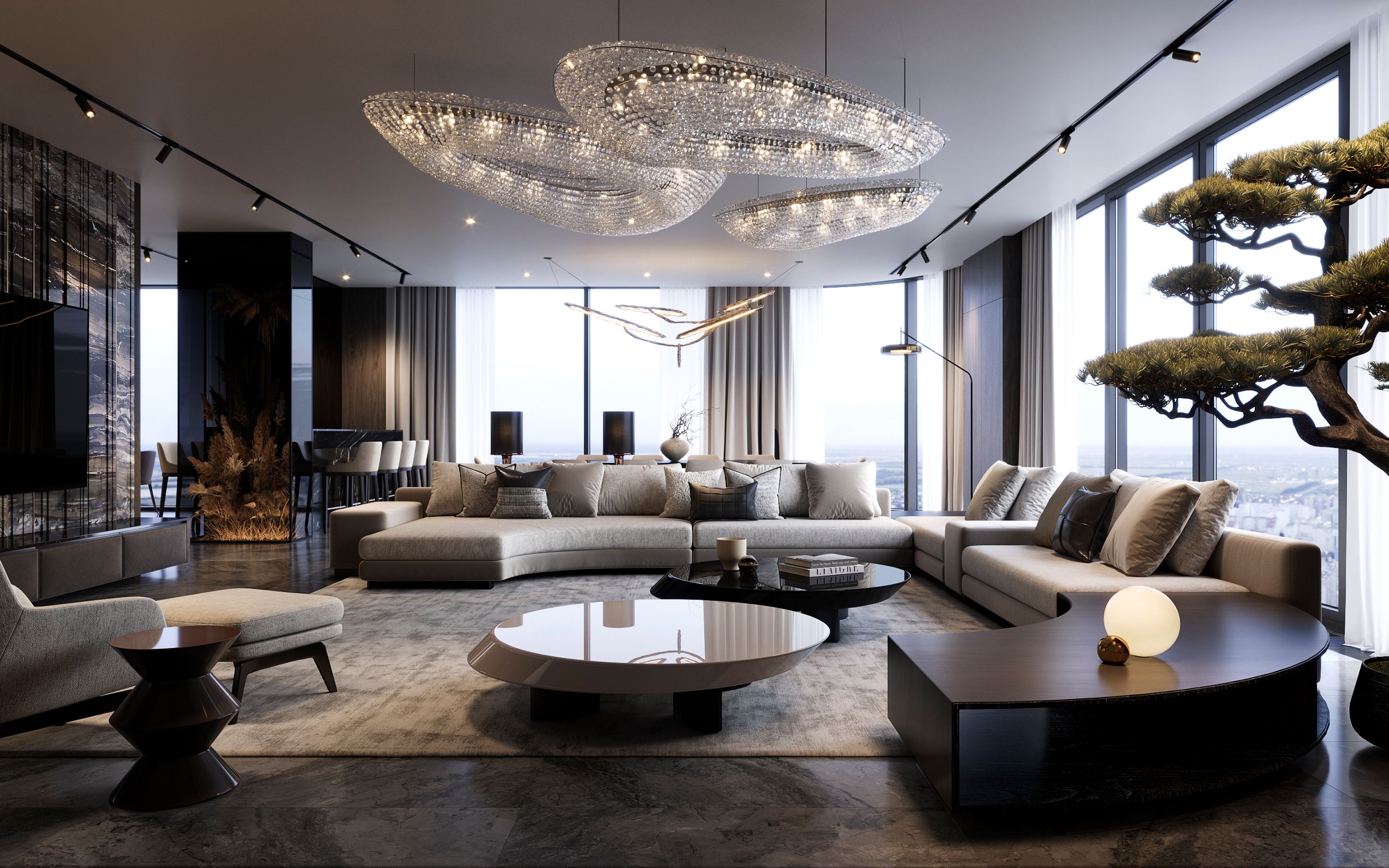
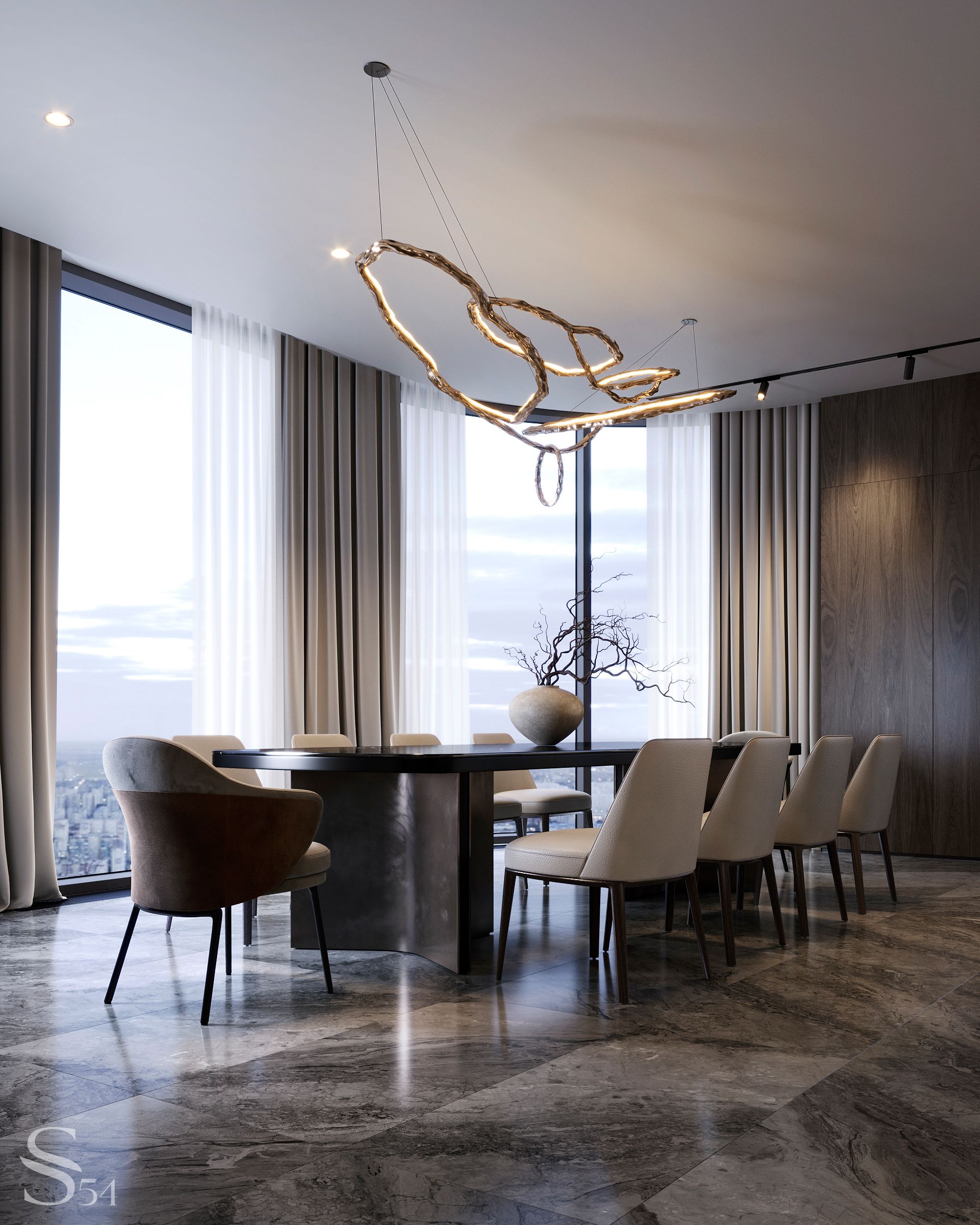
We decided to save space and avoid unnecessary walls not only in the hallways, but also in the main rooms. Thus, the idea of combining the living room, dining room, and kitchen was born. Panoramic glazing enhances the effect of an open floor plan. In an apartment with floor-to-ceiling windows, there is a sense of spaciousness and abundant natural light. The designer's task is not to worsen the initial but to improve it with furniture, decor, and plants.
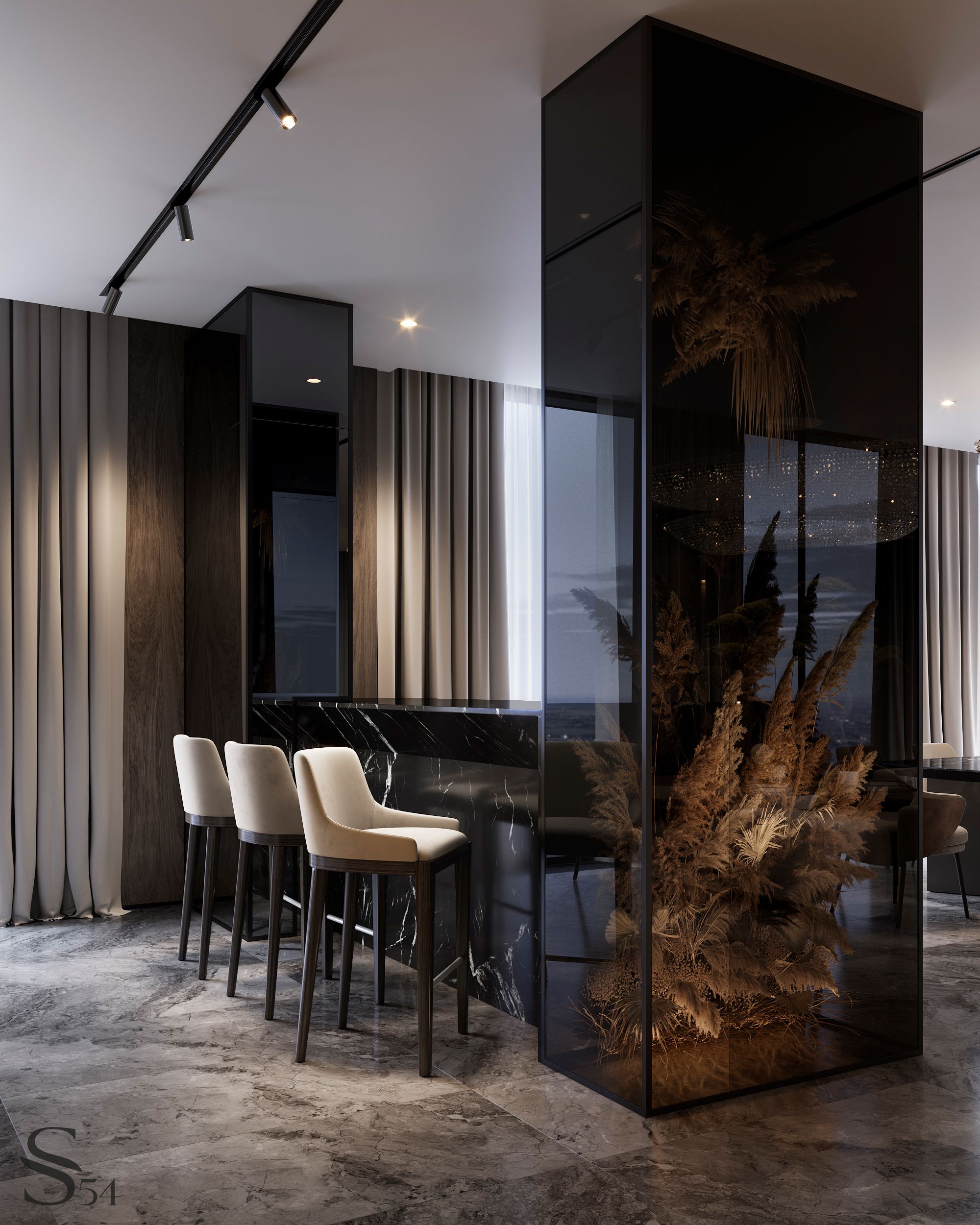
One of our valuable discoveries in zoning is a glass cube with a display case for dried flowers, accompanied by an island that separates the kitchen area from the living room and dining room. This headset was invented to provide symmetrical support for the column located near the window. The column is a structural pillar, and it is impossible to remove it. But there was a great opportunity to incorporate it into the interior, and it seems that we have succeeded.
The furniture in the living room perfectly meets the customer's requirements. It is comfortable and minimalistic, adding a touch of color that complements the shades in the design of the floor and walls. Its curves also help to soften the starkness of the leather, metal, and marble.
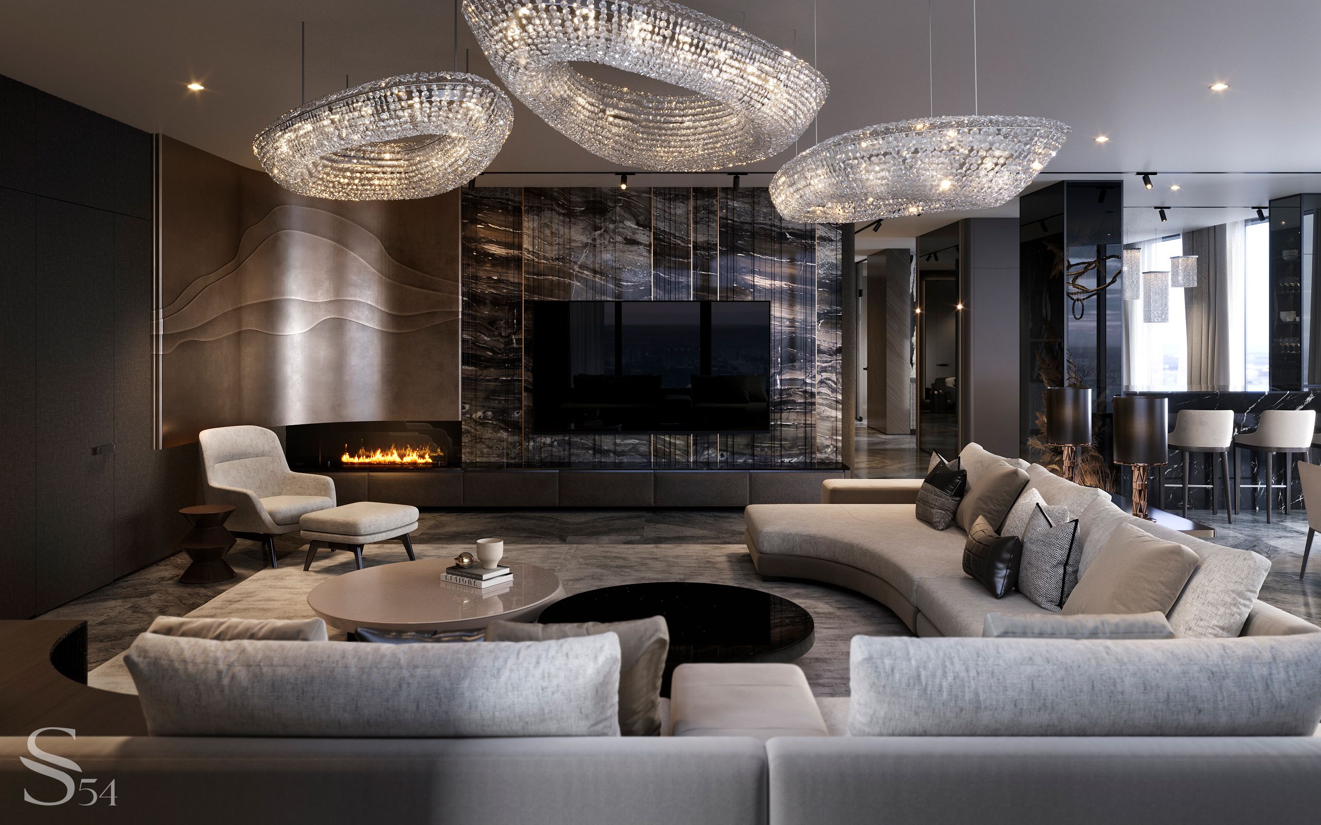
Not only is the furniture rich in curves, but the wall decoration is as well. Hidden, rounded corners are one of the techniques that can be used to identify the interiors of Studia 54. In the living room, we used a metal panel with a galvanized coating to complement the marble behind the TV, the bio fireplace, and the textile upholstery on the wall. A combination of an armchair, an ottoman, and a table leaves no doubt: a corner is not an unavoidable flaw in a square room, but a spot for a cozy evening near the fireplace.

Magic lamps from the Hungarian brand Manooi, along with a bonsai plant, fill the space with energy and contribute to harmony and comfort.
Master Block: Rooms for Work, Rest, and Dolce Vita
Once upon a time, Venetian mirror masters added gold to the amalgam, believing that it would enhance the beauty of the image. However, an unknowing person would never have guessed that the gold on the other side of the glass is responsible for the magic.
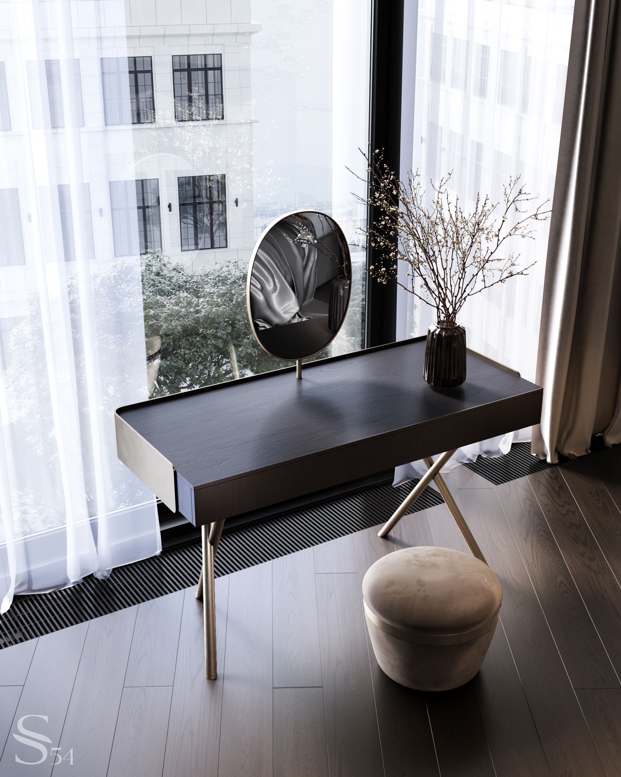
There are metallic accents in the interiors of Studia 54, but the main gold is always behind glass. It is evident in the choice of materials, attention to detail, balance of forms, and the thought that lies behind the apparent simplicity. There is nothing secondary in our designs. Even private rooms, which no one will see, are not inferior to the "grand" ones in terms of atmosphere and quality.
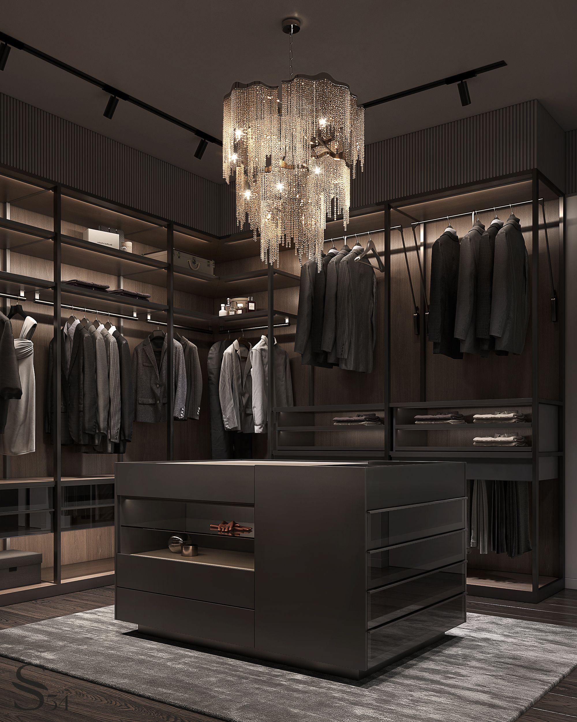
The dressing room is an independent space for enhancing beauty. The chandelier from Terzani makes it clear that every detail of the premises is high-class. An open storage system and lightboxes transform everything placed here into works of art.
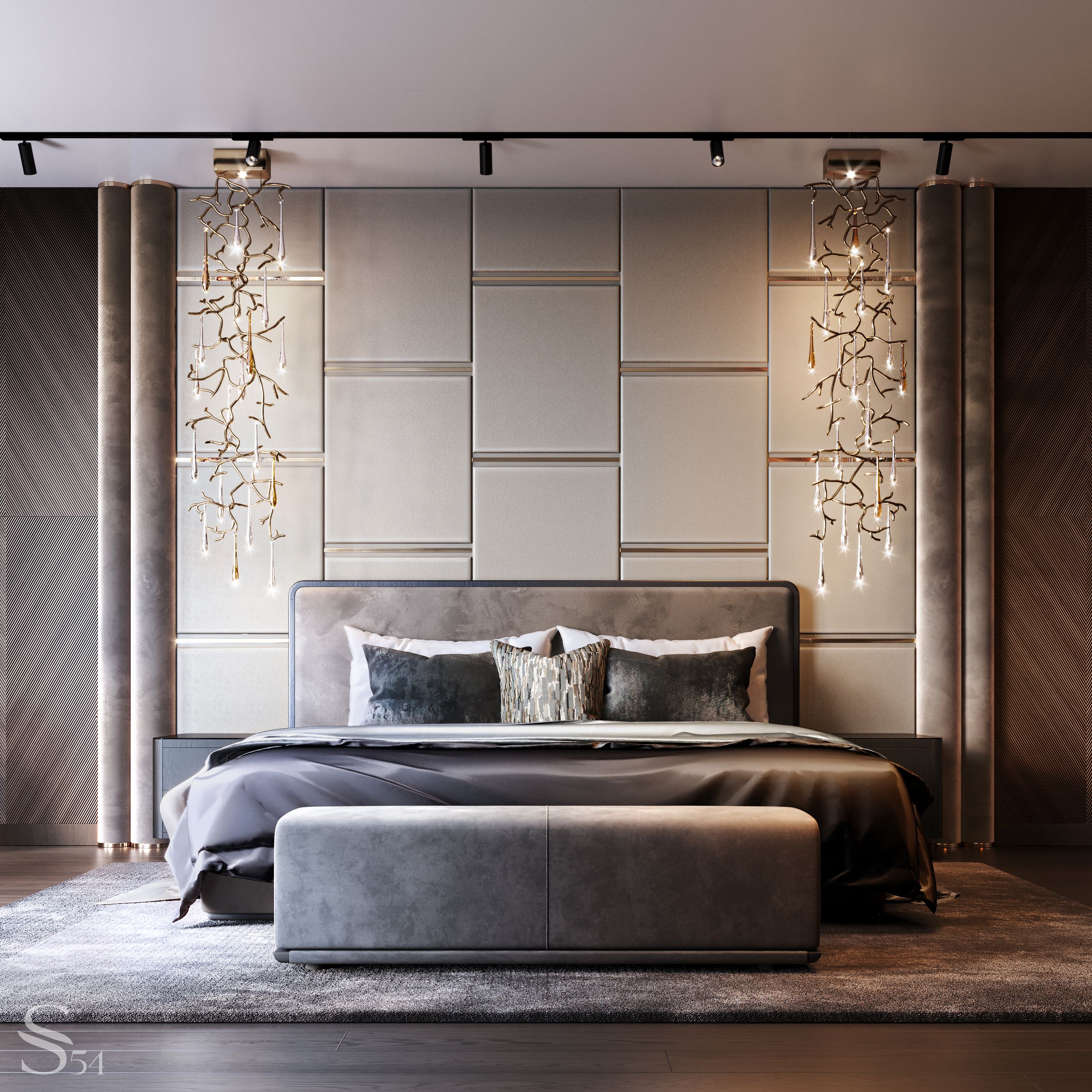
The master bedroom embodies the concept of "quiet luxury." It is everywhere: in leather, suede, and brass on the panels behind the bed, in an assortment of wood on the walls, in a tinted mirror that we use for our favorite trick of rounding corners, and in lamps that resemble either raindrops or alchemical gold.
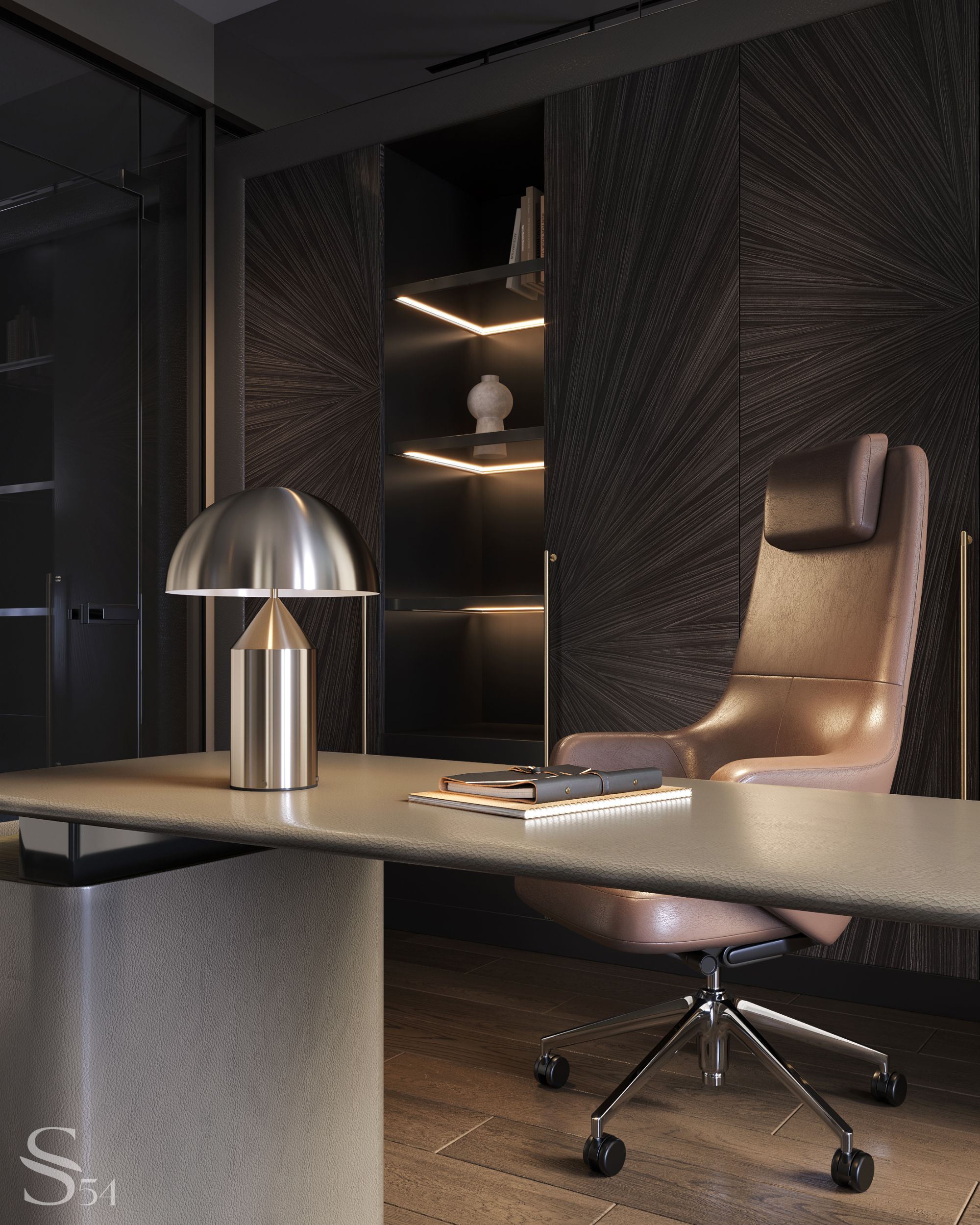

The cabinet enhances the overall ambiance of the interior. Veneer with an intricate pattern adorns the leather-trimmed table, while marble with a classic texture serves as a panel. These accent decor pieces, along with the comfortable furniture, create a functional yet visually appealing work area.
Guest Rooms: Almost better than home
The customer often hosts guests. Therefore, we have designed the premises in such a way that they are appealing to most people. The overall style and dignity of the apartment were preserved at the same time.
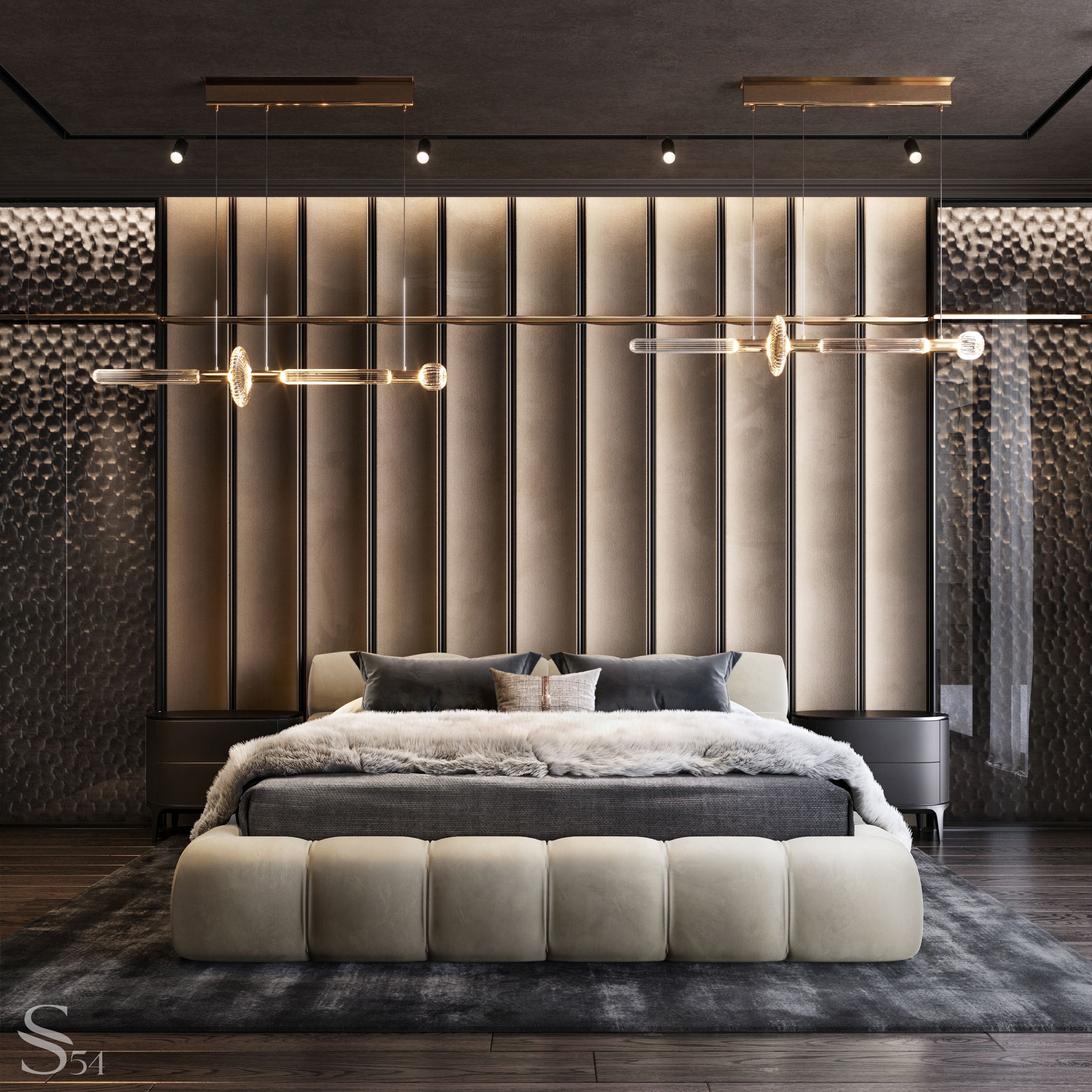

Upholstered furniture from Minotti and bedroom decor invite you to stay and relax. You can luxuriate in the softness of the fur blanket, appreciate the radiant glow of the paired chandeliers from the renowned Portuguese brand Serip, and admire the intricate carving on the wooden panel behind the bed.
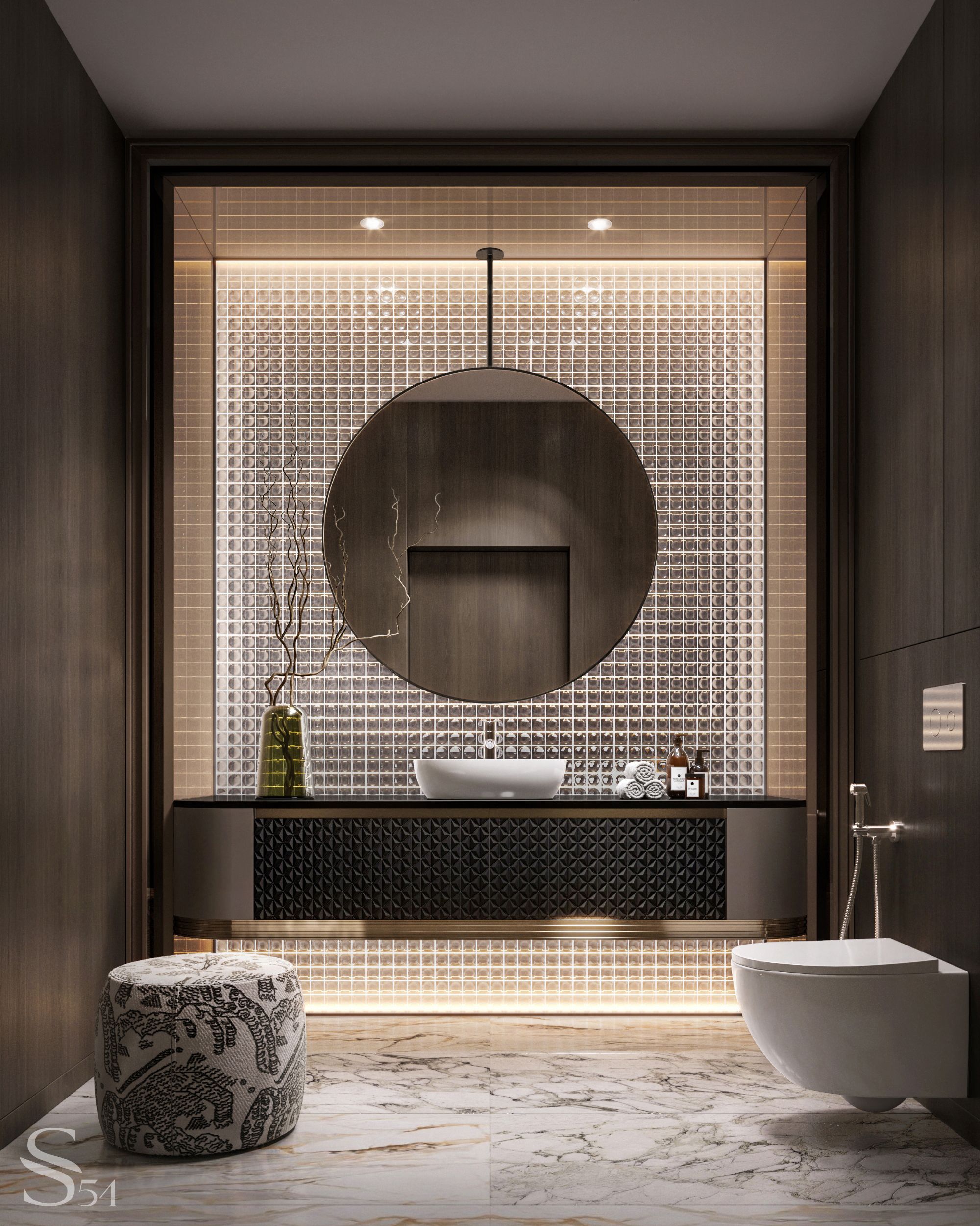
The bathroom with an oriental flair is the epitome of harmony and balance. A round-shaped mirror, like the sun, illuminates and unifies the space. This feeling is enhanced by a glass panel reminiscent of shoji, a traditional Japanese partition. It creates the feeling that the sunlight is about to break through.
The oriental motif is complemented by a minimalist vase filled with dried flowers and an ottoman featuring a print - either a Chinese embroidery or a Kenzo-ish crouching tiger.
Arthur Schopenhauer wrote, “Every man takes the limits of his own field of vision for the limits of the world.” Studia 54 creates their designs to expand both their own and your perception limits.
*pied-à-terre* — urban housing that is used as a short-term residence by an owner.