/ Interior
~ 5 min
Published: 18/12/2025
Our portfolio reflects the recognizable style of Studia 54 ® through carefully balanced color combinations and compositional accents that reveal the geometry of space, transforming interiors into a source of inspiration.
An abundance of details adds warmth, while custom-designed lighting installations and artworks by world-renowned artists fill the interiors with depth and refined luxury.
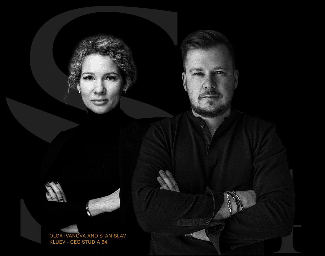
Using Studia 54 ® projects as examples, we explore how complex shades of gray interact with one another, with natural textures, and with bold accents to create expressive, architecturally precise spaces.
Color as the Foundation of Contemporary Aesthetics
Gray is not the absence of color, but a rich system of undertones. From cool silvery graphite to warm shades of stone dust, each variation influences the perception of materials, light, and proportions.
In Studia 54 ® interiors, gray never exists on its own—it is always engaged in a subtle dialogue with the expressive veining of natural stone, warm wood tones, matte textures of velvet and leather, noble metals, and accent art objects.
This approach transforms a restrained palette into a complex composition, where every shade contributes to the atmosphere of the space.

Pantone 2026 Cloud Dancer: The White That Gives Gray Volume
According to Pantone, Cloud Dancer will be the key color of 2026. At Studia 54 ®, we understand why this particular white will shape future aesthetics and we know how to work with it so it never feels sterile. Cloud Dancer has a soft warmth that adds depth to gray interiors and makes volumes appear cleaner and more expressive.
In a 2,750 m² residence project in Rublyovo, the clients’ main preference was a dark monochrome palette. They wanted a contemporary design without short-lived “trend-driven” solutions — an interior that would remain relevant for years to come.
By incorporating the key color of 2026, we achieved this goal while preserving a sense of premium luxury. A snow-white sofa group becomes a precise visual accent: it both contrasts with the dominant gray tones and emphasizes their depth, enhancing the harmony and status of the space.

Effects of Using Cloud Dancer with a Gray Palette
Visual Lightness
Warm white acts as a “breath” within the composition, separating heavy stone and wood textures and softening their presence.
Architectural Clarity
Against a backdrop of Cloud Dancer, gray surfaces appear deeper, and volumes feel larger and more graphic—especially effective in expansive spaces with high ceilings and double-height living areas.
Unspoken Luxury
The plasticity of gray pairs beautifully with dark palettes, enhancing interior dramaturgy. For example, in a 937 m² house project in Prague, light accents reveal the beauty of dark living room walls.

How to Integrate Gray into an Interior Correctly
Use Natural Materials
Natural stone and wood are the perfect companions to gray tones, adding stability, expressiveness, and architectural character. In the Czech project, gray unfolds through Café Moca marble, deep ash-toned velvet, and smoked glass, creating a layered palette without excessive coldness.

Experiment with Lighting
In dark color schemes, lighting becomes more than a functional element—it is a tool for shaping volume. In Studia 54 ® projects, lighting is always multi-scenario: from soft perimeter illumination to large glass chandeliers reminiscent of raindrops or ocean waves. This approach highlights the materiality of gray and adds spatial depth.

Combine Gray with Warm Accents
To avoid a sterile or overly cool atmosphere, gray should be complemented with warm tones—from Cloud Dancer and creamy nuances to caramel wood, brass, and deep burgundy. These details add tactility and emotional richness while preserving restraint.

Maintain a Balance of Scale
Gray performs exceptionally well in large spaces: it structures the area, making interiors feel monumental yet uncluttered. Thanks to its neutral depth, gray unifies architectural lines and large forms, creating a harmonious perception of volume.

Gray as the Language of Contemporary Luxury
Today, gray has become an integral element of quiet luxury—one of the most universal tools for creating timeless interiors that remain relevant regardless of trends.
That is why color is a foundational part of every Studia 54 ® concept: it emphasizes design decisions, enhances the expressiveness of art objects, supports a sense of comfort, and forms the visual code of a premium space.