/ Interior
~ 5 min
Published: 16 may 2024
The influence of color on mood
Contemporary psychologists assert that color palettes wield considerable influence over individuals' moods. The perception of color is intertwined with subconscious associations, with genetic memory playing a pivotal role. Light hues evoke daytime and brightness, while darker tones are suggestive of evening. Various shades of green evoke connections to the natural world.
Swiss scientist Max Lüscher conducted a series of studies on the impact of different colors on human psychophysiological reactions, providing evidence of such correlations. Numerous trials revealed that red prompts heightened heart rates and blood pressure, whereas dark blue exerts a calming effect.
However, color perception is also contingent upon cultural nuances. The interpretation of a color may vary across different societies. For instance, white symbolizes mourning in China, whereas it connotes purity in Russia.
Color Temperature
According to the widely accepted classification, colors are categorized into warm and cool tones. This classification stems from a series of associations ingrained in humanity over millions of years: blue brings to mind cooling water and ice, while the blend of red, orange, and yellow is reminiscent of the sun, fire, and molten metal.
In reality, describing a color as warm or cool is somewhat abstract. When different sensory receptors intertwine, it's termed synesthesia. For instance, tactile sensations (temperature) can be perceived as visual (color).
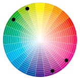
It's worth noting that even within a single palette, there are shades that may feel warmer or cooler. This is a relative distinction that holds significance for interior designers. To achieve a harmonious color scheme, professionals often turn to the color wheel devised by Johannes Itten.
Itten's color wheel offers a graphical representation of all primary colors and their nuances in a circular format. It is segmented into sectors, each representing a distinct color.Itten's color wheel offers a graphical representation of all primary colors and their nuances in a circular format. It is segmented into sectors, each representing a distinct color.
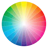
When designing home interiors, one of the primary tasks for a designer is to establish the color palette. Depending on how many colors are incorporated into the space, the following combinations, utilizing the color wheel by Itten, are identified:
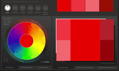
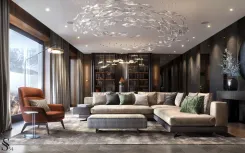
Monochromatic: This scheme involves selecting one primary color and using its various shades, ranging from light to dark. For instance, from pale blue to deep navy.
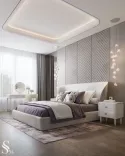
In this interior, the palette showcases a range of brown-beige hues.

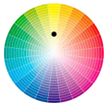
Complementary color scheme:This approach involves using opposing colors on the color wheel to create contrast. Examples include blue and orange, red and green. This combination generates a lively and dynamic effect.
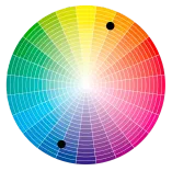
In the design of this living room, contrasting colors like orange and olive dominate in the accent areas.
Analogous: In this scheme, adjacent colors on the color wheel are chosen. For instance, yellow and blue can complement the main green color. This results in a balanced and harmonious combination.
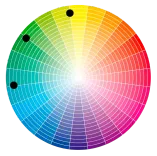
The decor features shades of blue, olive, and violet.
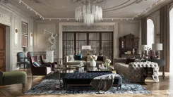
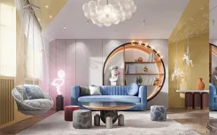
Accent-Analogy: Similar to the analogous scheme, but with the addition of a complementary color to create an accent. For instance, for the main green color, you might add red as an accent, while using orange or pink as additional colors.
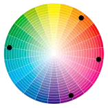
In the interior of the children's playroom, colors from neighboring sectors of the Itten color wheel dominate – yellow, red, orange, along with the contrasting blue.
Triad: To establish a triadic color scheme, three equidistant colors are selected from the color wheel. For example, red, yellow, and blue. This ensures a lively harmony and vibrancy.
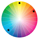
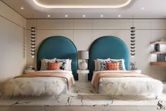
In the child's bedroom, the color palette is composed of shades of orange and the contrasting hue of seafoam.
Tetrad: This is a more intricate scheme employing four colors, arranged in a specific order on the color wheel. You might choose two pairs of complementary colors or two pairs of analogous colors. This results in a rich and varied palette with a wide range of possibilities.
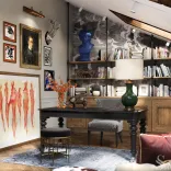
In the showcased interior design of the office, the prevailing colors among the decor elements are green, blue, orange, and red.
Rules of color combination in interior design for different styles:
Modern Style: the focus is on shades of gray, white, and black, complemented by vibrant accents.
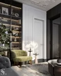
Classic Style: Neutral tones are used, often paired with touches of gold or silver to evoke an atmosphere of aristocratic luxury.
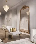
Minimalism: The palette is kept simple, consisting of a few subdued colors without strong contrasts.
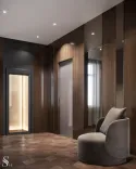
Eclecticism: Boldly combines different colors and textures to create a distinctive look.

Color combinations in different room interiors
Each room in a house serves a unique function and atmosphere, which can be enhanced through the combination of colors in the interior.
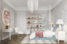
In the bedroom, where tranquility and relaxation are paramount, it is recommended to use soft and soothing tones, such as pastel blues, lavender, or beige hues.
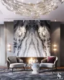
In the living room, the focal point of family gatherings and parties, one can experiment with brighter and more vibrant shades. They inject energy into the space, adding dynamism.
In the kitchen, where meal preparation is combined with family dinners, warm and cozy tones are suitable. They create a pleasant atmosphere and stimulate the appetite.
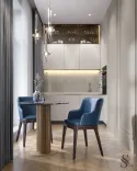
In the dining area, one can introduce bold and vivid accents, for example, through colorful cushions or other decorative elements.
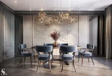
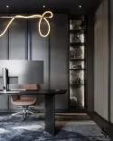
In the office or workspace, where concentration and productivity are crucial, it is advisable to use calming colors such as gray, brown, blue, or green. They help to focus on work and achieve better results.
Tips for сreating a harmonious interior
1. Selecting foundational colors is a pivotal step that establishes the design's groundwork. These hues should serve as the cornerstone of the interior's aesthetic.
2. Subsequently, identifying complementary colors is crucial as they contribute to the overall harmony of the space, accentuating the primary tones
3. Maintaining a cohesive overall picture is essential. Avoid overuse of bright hues, which can disrupt the stylistic coherence of the interior and create cognitive dissonance.
4. Consider the impact of color on spatial perception. Lighter tones tend to expand the space, while darker shades are more suitable for larger rooms to prevent a feeling of confinement.
5. When choosing a background, opt for neutral and soothing tones that won't strain the eye and will remain timeless. Adhering to the established rule of color combination – 75% primary, 25% secondary, and only 5% for accentuation – ensures a harmonious interior.
The correct combination of colors in an interior is of great importance for creating a cozy and pleasant atmosphere at home. By following the tips and principles outlined above, you will be able to create an interior that not only reflects your style but also contributes to your well-being and comfort.


